Three homepages, one chat, one design system
A working concept in Next.js, built to your brief: mobile-first, your fonts and palette merged into one token set, and the Juno chat with its streaming, thinking, searching and error states. Open it on your phone; that is where it was designed first.
 A
AEditorial cover
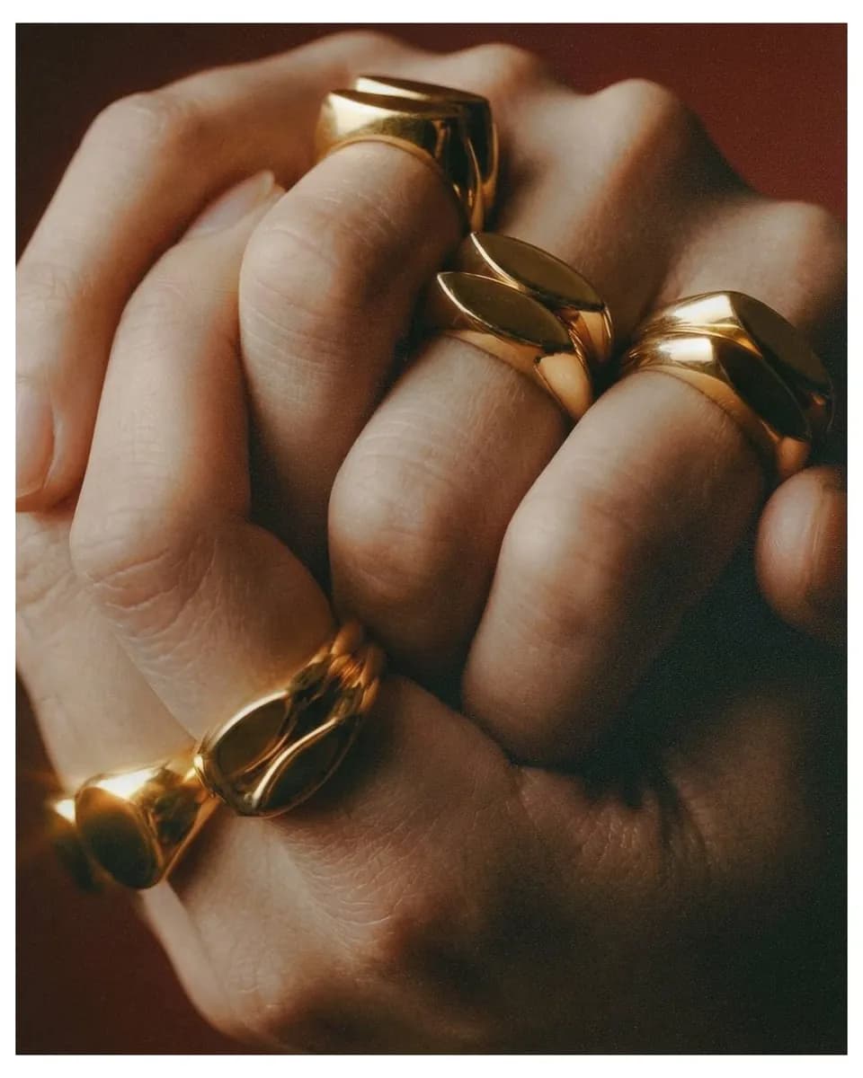
The homepage reads like a jewellery magazine: one full-bleed photograph, the masthead, and cover lines that open Juno. Scrolling turns the pages.
- Choose it if:
- The brand should feel most like a publication and least like a shop.
- Trade-off:
- The chat is one tap away, not on the first screen.
- B
Sterling hallmark first
Trust leads. The Sterling mark is struck on arrival and walks the scale from A+ to C, with the pieces it has passed right underneath.
- Choose it if:
- The honesty of Sterling is the reason people choose you.
- Trade-off:
- Asks visitors to care about grading before they have met Juno.
 C
CConversation as hero
The first screen is Juno at work: a buyer describes someone, Juno asks one question, then a graded shortlist lands. Then it is your turn.
- Choose it if:
- The goal is more people starting a conversation.
- Trade-off:
- Less editorial; the photography does less of the talking.
The Juno chat
Shared by all three. Try it, then use the design review switcher to see every state.
Design system
Tokens, components, chat states, the photography treatment and a one-page usage guide.
An unsolicited concept by Kloudfirst Nextgen Systems Private Limited, prepared for the Contra brief. Photography is taken from junoandsterling.com for this private review only. Piece names, makers, prices and grades are sample content; the chat is scripted and not connected to any catalogue.